Пост 122810410

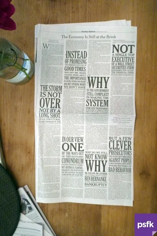
In Sunday’s New York Times, we noticed this interesting use of typography to highlight points in an opinion piece about the state of the US economy. Seems rather Victorian. (via Pic: Typographic Opinion, New York Times - PSFK.com)

In Sunday’s New York Times, we noticed this interesting use of typography to highlight points in an opinion piece about the state of the US economy. Seems rather Victorian. (via Pic: Typographic Opinion, New York Times - PSFK.com)